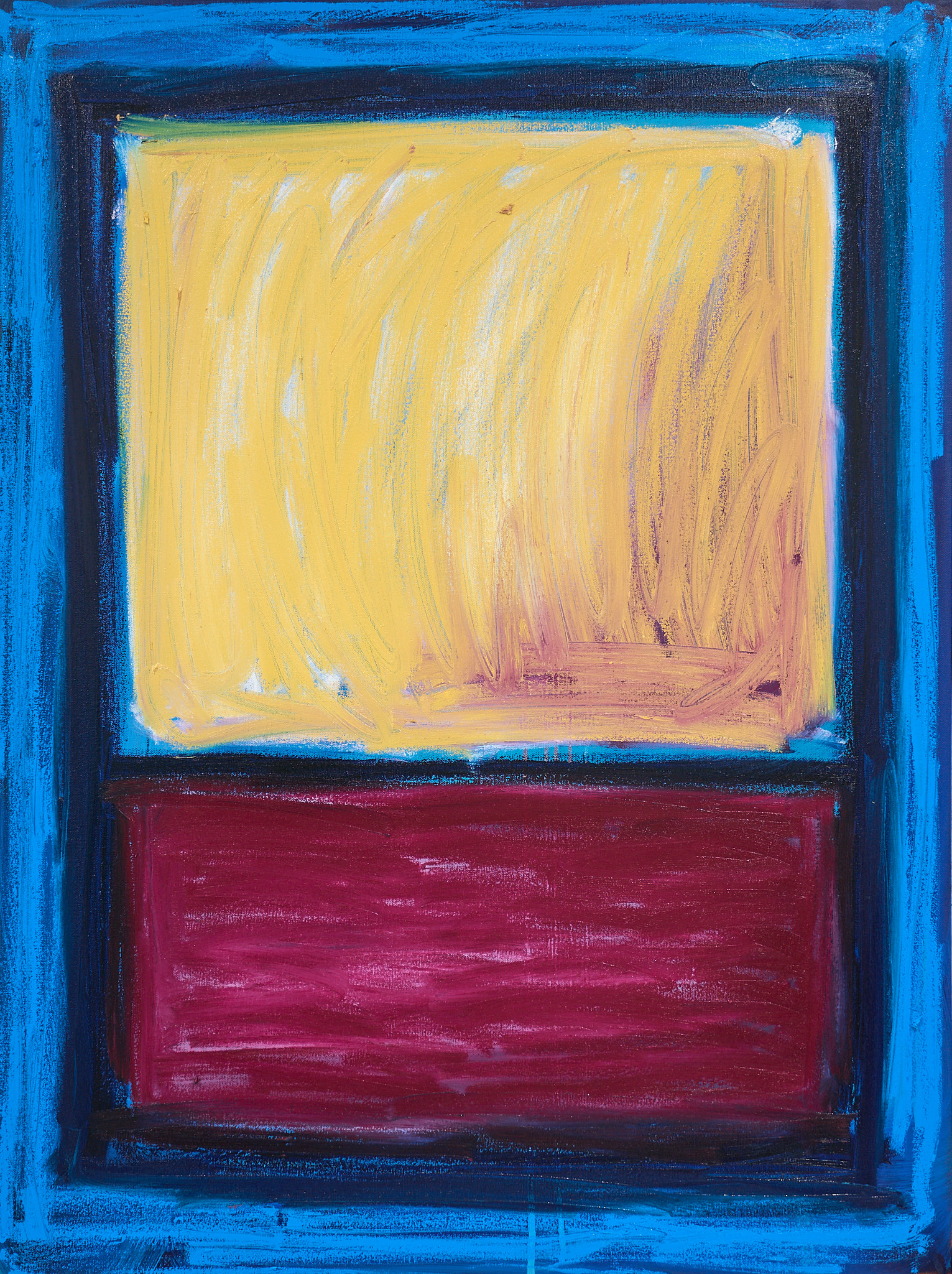
Madrid Blues

Everything about this piece is calm and stillness.

On a trip to Madrid, I randomly found a 100 year old paint shop.They have been hand-making oil paint for over a century.

I HAD to get some blue pigments to bring home with me, and what better way to showcase their beauty than with these color field pieces. I decided to create them on wooden panels so that the color of the wood contrasts beautifully with the blue. This natural look also helps create a calming and wondrous feeling I am going for with this piece… it brings elements of nature into the space it hangs.

The three hang together as one piece.

Full story below.

Medium:

Oil on Wood Panel

Size:

3 pieces, each 16” x 20”

Year:

2025

Price: $

8500

(sale discount automatically applied in cart)

Inquire for collection by emailing me directly at julian@juliancastro.art

Love this but it's sold? I work with collectors and designers to create custom pieces inspired by my sold work and collector preferences.

To discuss how we can make the perfect piece for your space, email us at julian@juliancastro.art

Piece is Sold
(Back to Available Works)
Loading AR...

In January 2025 I found myself strolling the street of Madrid with no destination or plan in mind, as I usually like to do while visiting foreign cities.

I had hopped over from Portugal, where I was visiting my family, and was spending a few days in Madrid with some friends.

That fateful day as a few of us were walking about, I saw a very old and cute looking art supply store… the name of the store was hand painted in an old font, the wooden trim of the doors and windows was clearly well worn, and inside was an array of art supplies and colors. I knew I had to stop in.

Inside we were greeted by a man who must have been in his 70s and was THRILLED to tell us all about the shop that had been there for over 100 years… his grandfather started it.

They have been making oil paint by hand for over 100 years. So of course, I had to get some to take home.

They had 3 different blues in stock, so that’s what I got (obviously).

Prussian Blue - a darker less saturated blue, almost like a midnight blue.
Cobalt Blue - a standard deep blue
Ultramarine Blue - a rich, saturated, bold blue (very similar to Yves Klein blue)

Armed with these delicious blues, I had a concept in mind I wanted to create to really showcase these shades of blue, and create a wondrous and calming art piece.

I knew that a walnut color wooden edge would be a beautiful backdrop to compliment the blue colors. The wood also creates a sense of calm security, rooting these pieces in space.

The surface is lightly textured as not to reflect any images, but captures a subtle glow of light in the blue pigments.

To me, this piece makes me stare, wonder, slow down, and enjoy observing not only the differences between the three, but the subtleties presence within each piece (yes they are there if you slow down enough).

Detail Images

No items found.

See This Piece On A Wall

No items found.

Explore Other Paintings